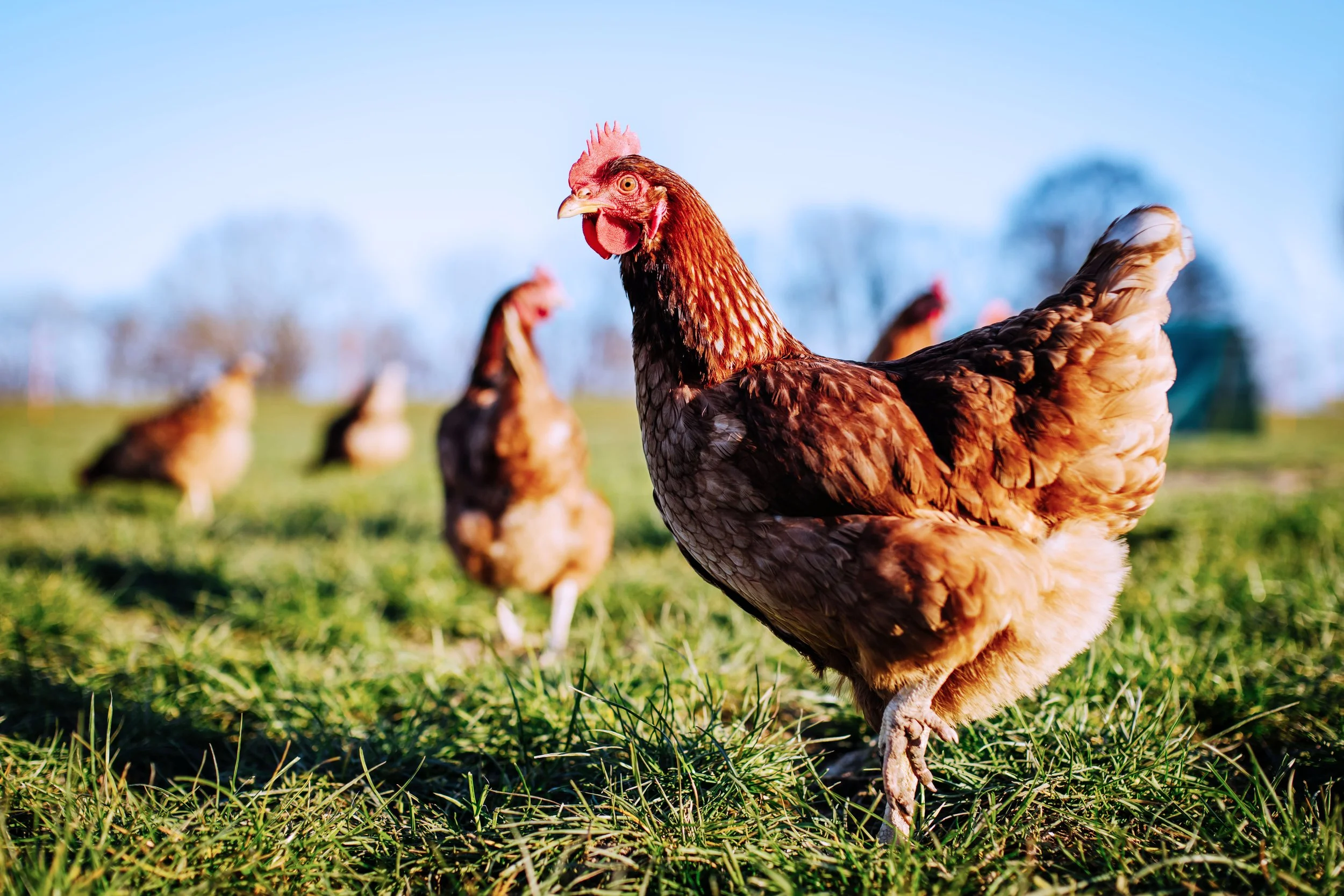
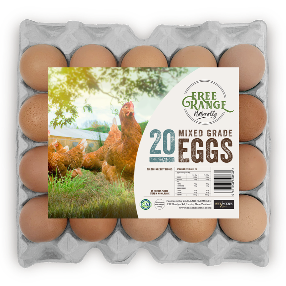
Family owned and operated Zealand Farms are all about producing great eggs for Kiwis – Free Range and Organic – from the great outdoors.
What’s the story? / We’ve been working with Zealand Farms for several years, bringing their family story of ethical farming values to life across a range of brand and marketing collateral and products. From initial identity design, marketing strategy, to a range of unique product packaging, we’ve helped amplify their business within a highly competitive space.
Product Naming
Visual Identity
Packaging Design
Website
Print Media
Copywriting
“A TASTE OF THE GREAT OUTDOORS”
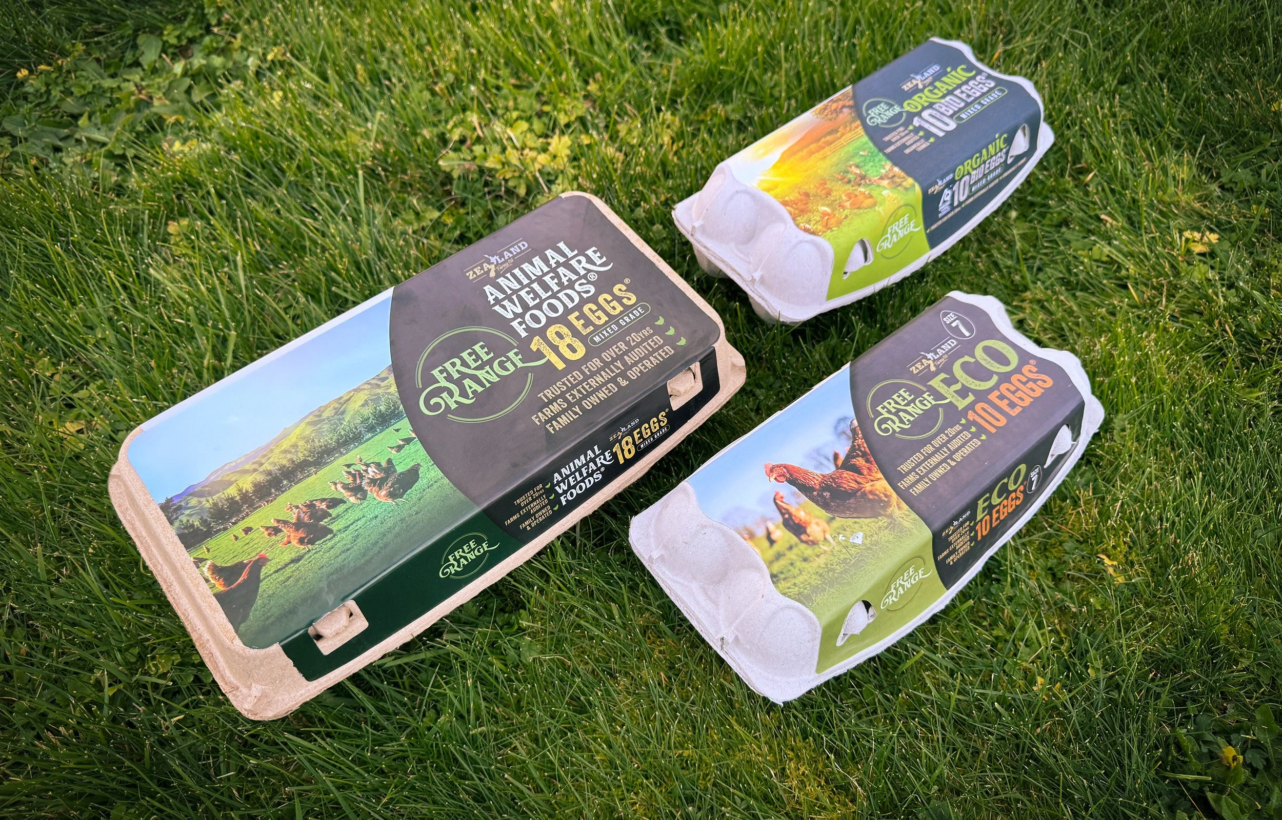
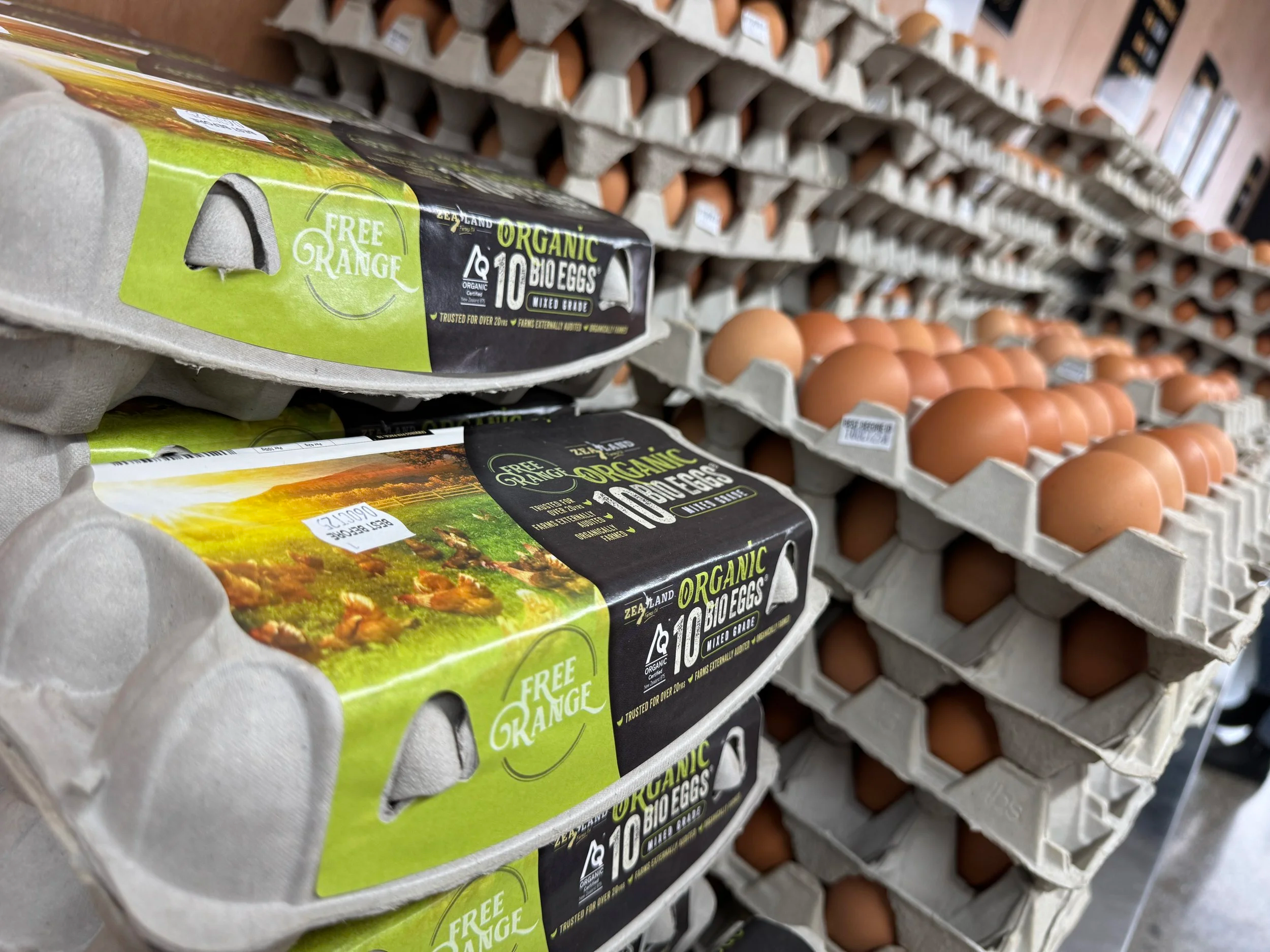
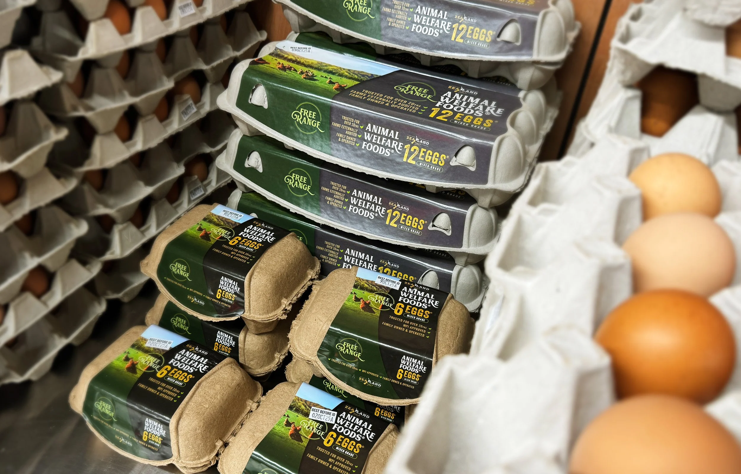
Zealand Farms reached out with an exciting opportunity to pitch a new family of free-range eggs to major supermarket brands.
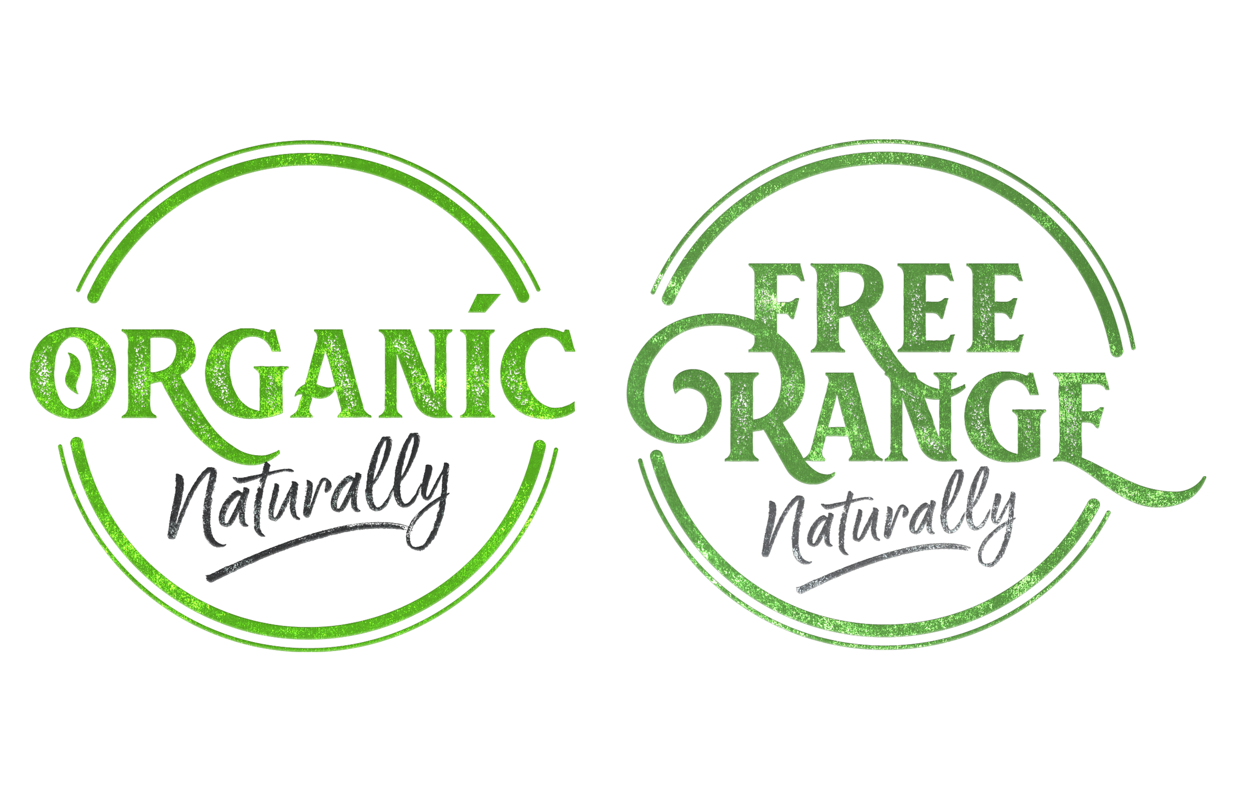
After creating a compelling presentation to buyers, we worked on a range of three brands, all with a unified family look. Each packaging design featured new branded emblems, distinctive woodcut-styled fonts and emblems, outdoor photography, and a colour palette that evoked a natural, ‘kiwiana’ feel.
These elements ensured that Zealand Farms products would stand out on supermarket shelves.
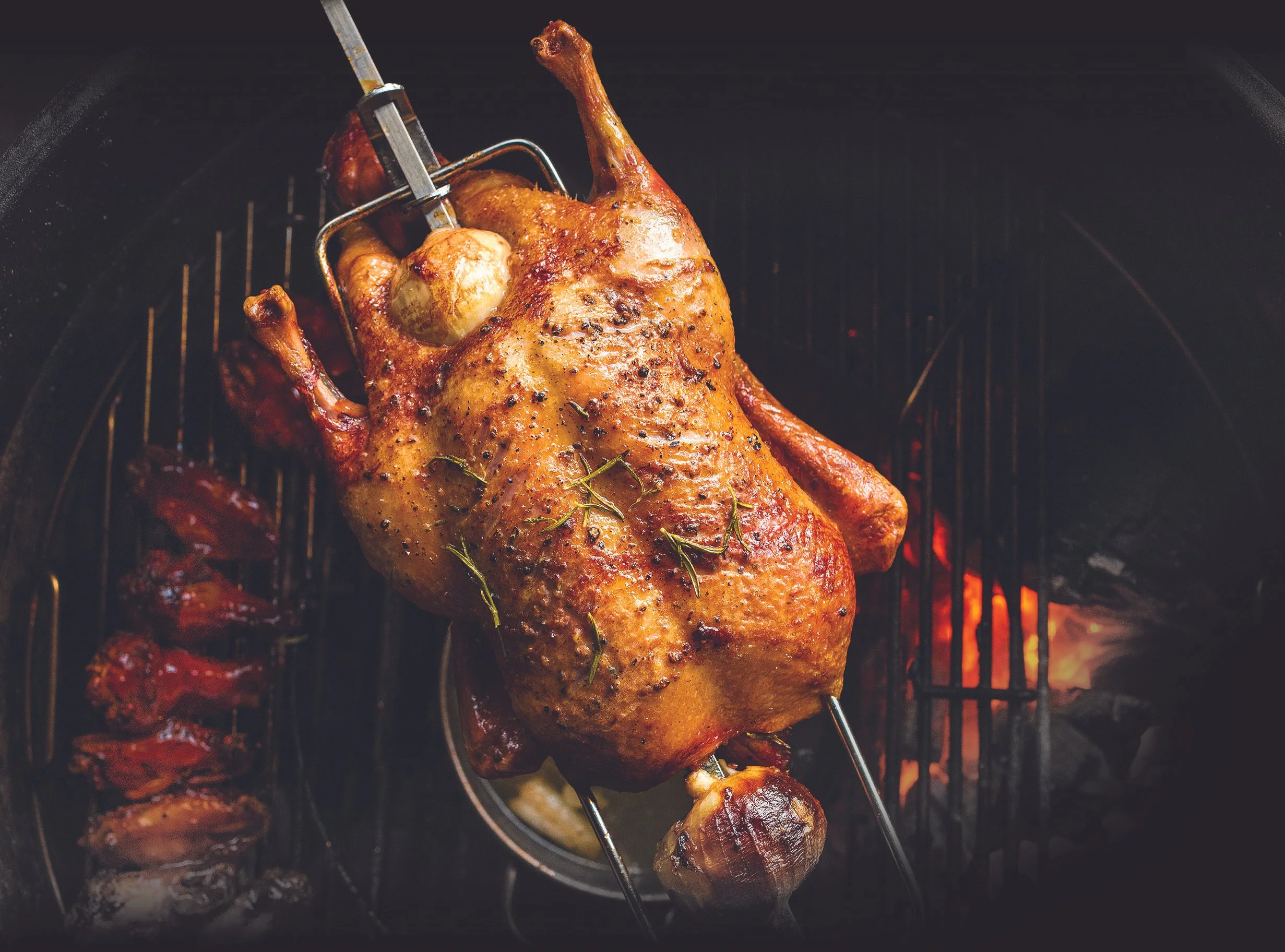
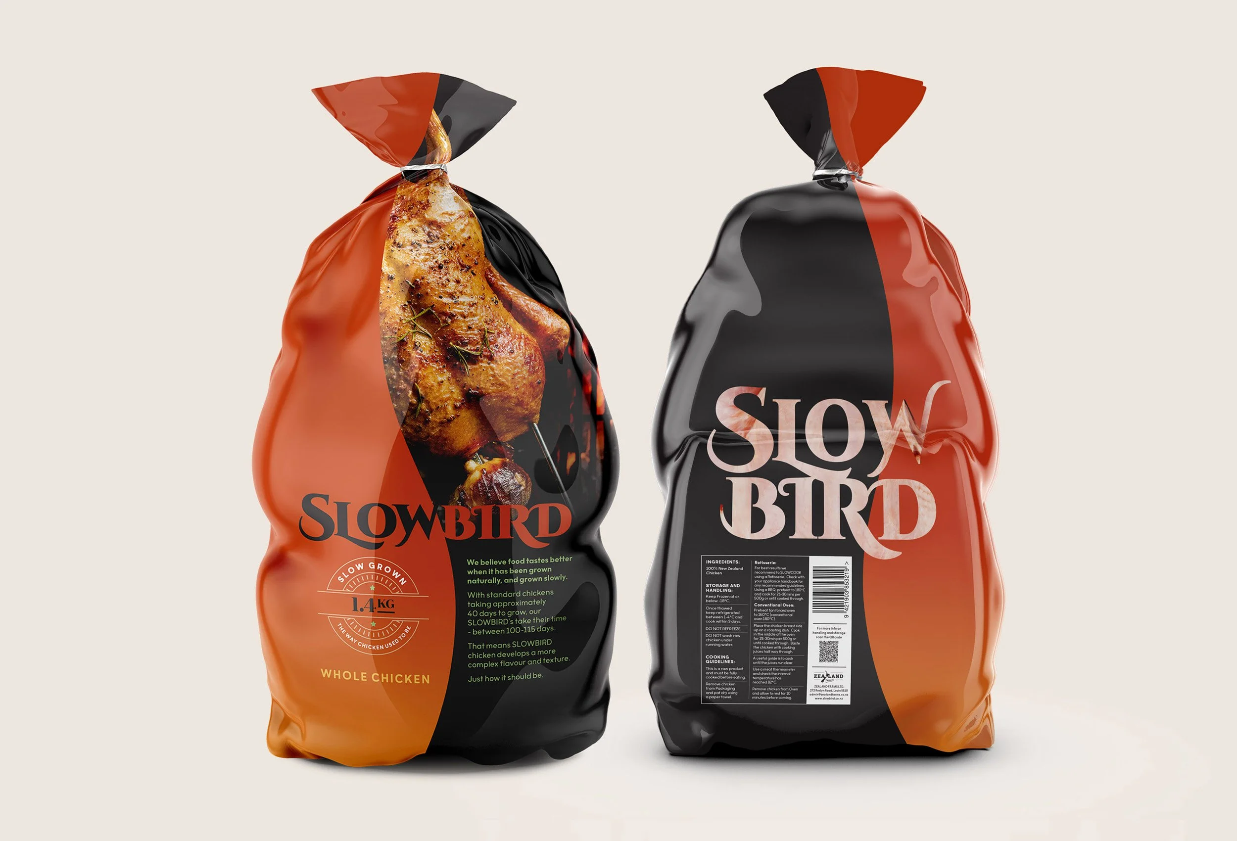
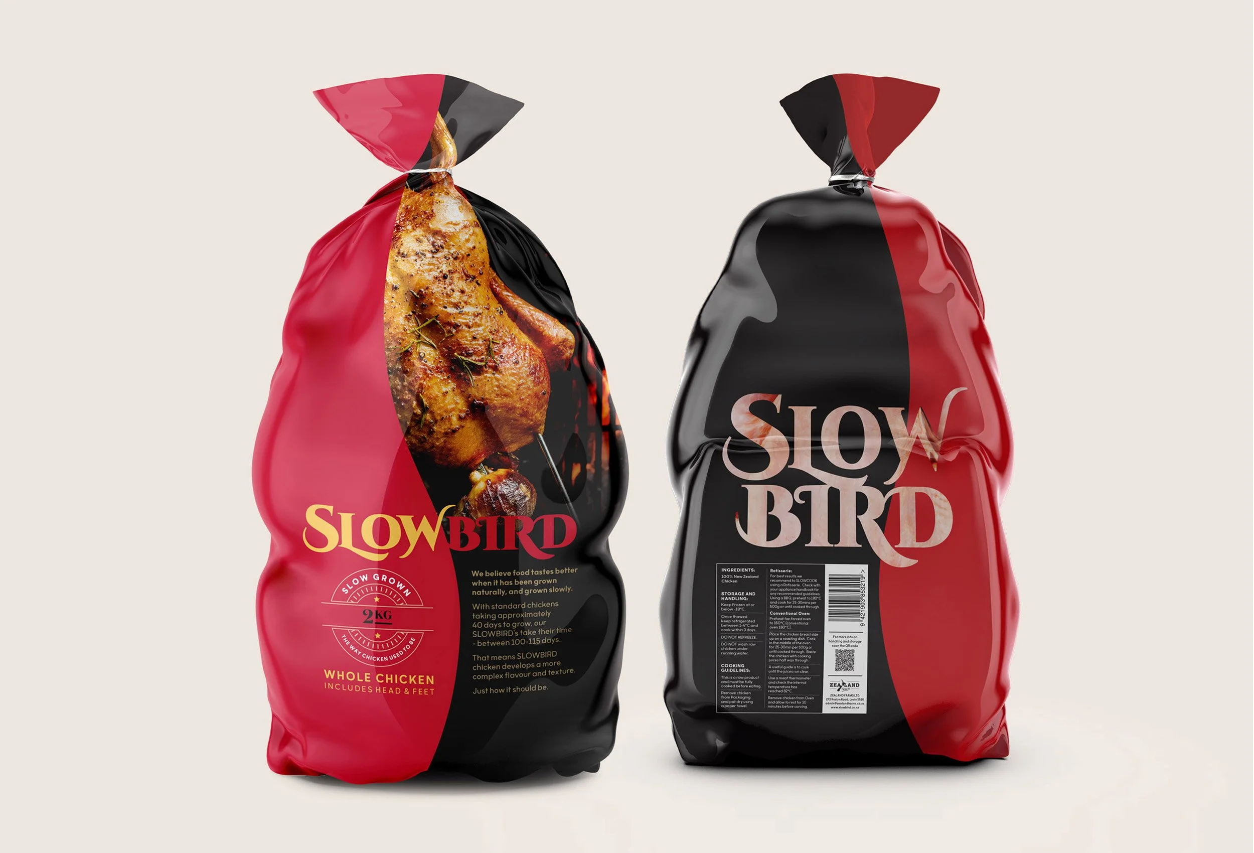
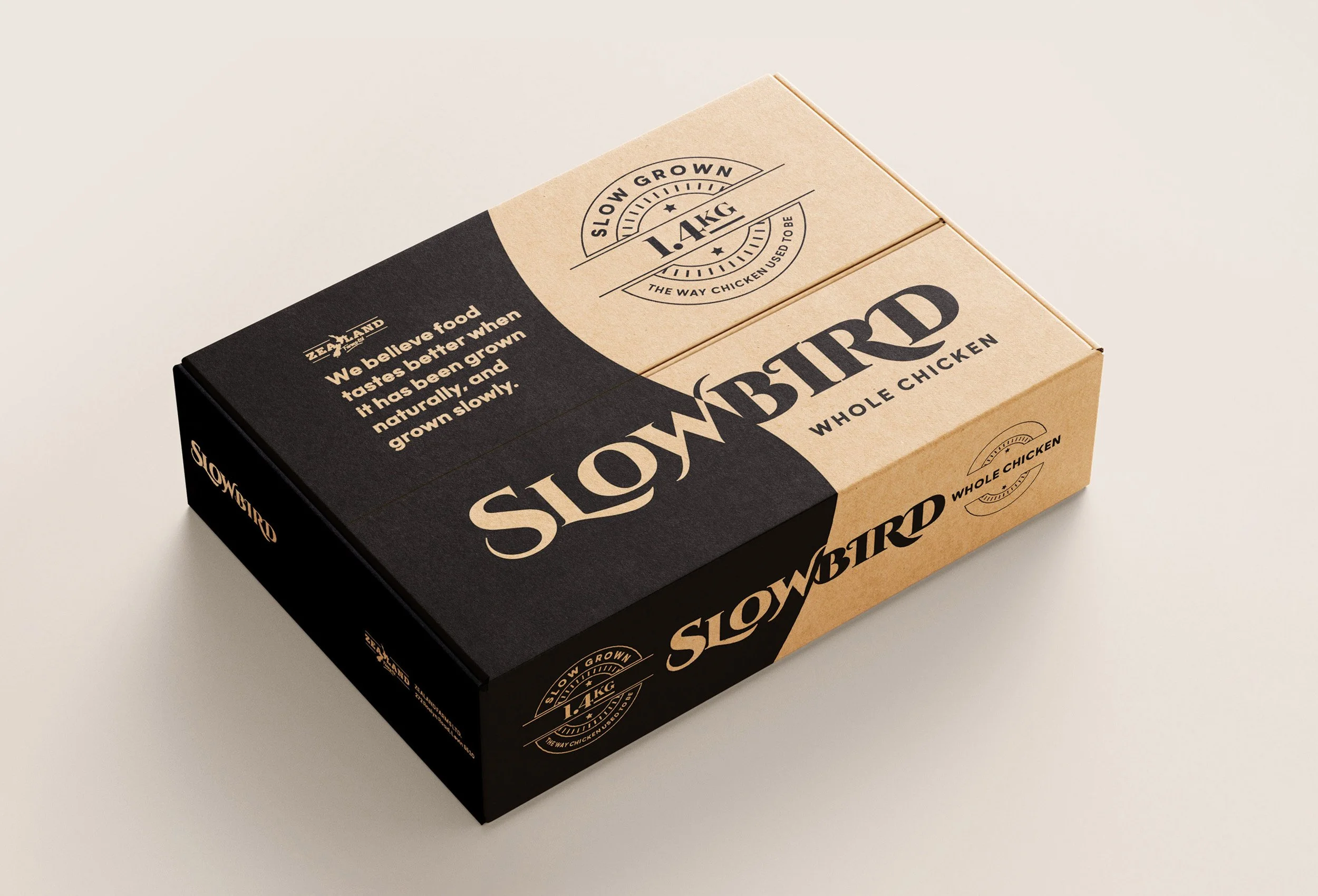
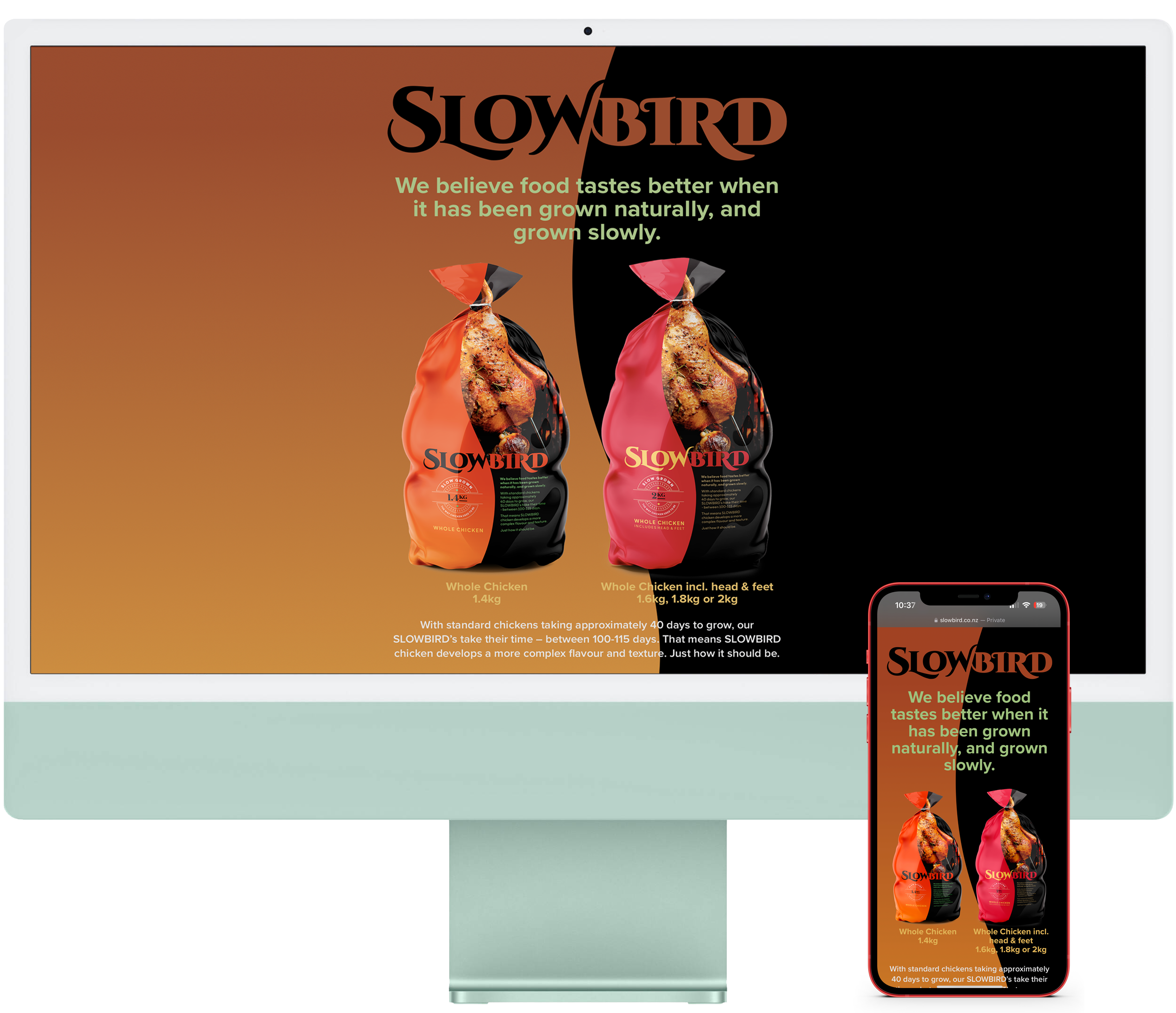
Introducing “Slowbird”– A whole chicken grown naturally, grown slowly
What’s the story? / Zealand Farms reached out with an eye on a new product market, the slow-grown chicken. With two premium markets in mind, we were tasked with creating the brand name and packaging design to promote the benefits of a slow, deliberate cooking process that results in a rich, more complex flavour than standard chickens.
Two types of packaging were required: one for the ‘Whole chicken including head and feet’, a delicacy in China, with a traditional Chinese colour palette; and the second for the ‘Whole Chicken’ design, which reflects a wider European market. The design also features a clear ‘product viewing logo window’ on the back.
Product Naming
Visual Identity
Packaging Design
Website
Copywriting
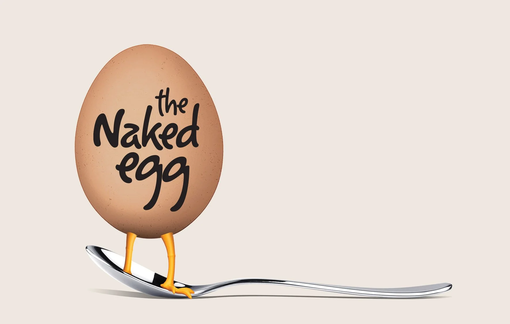
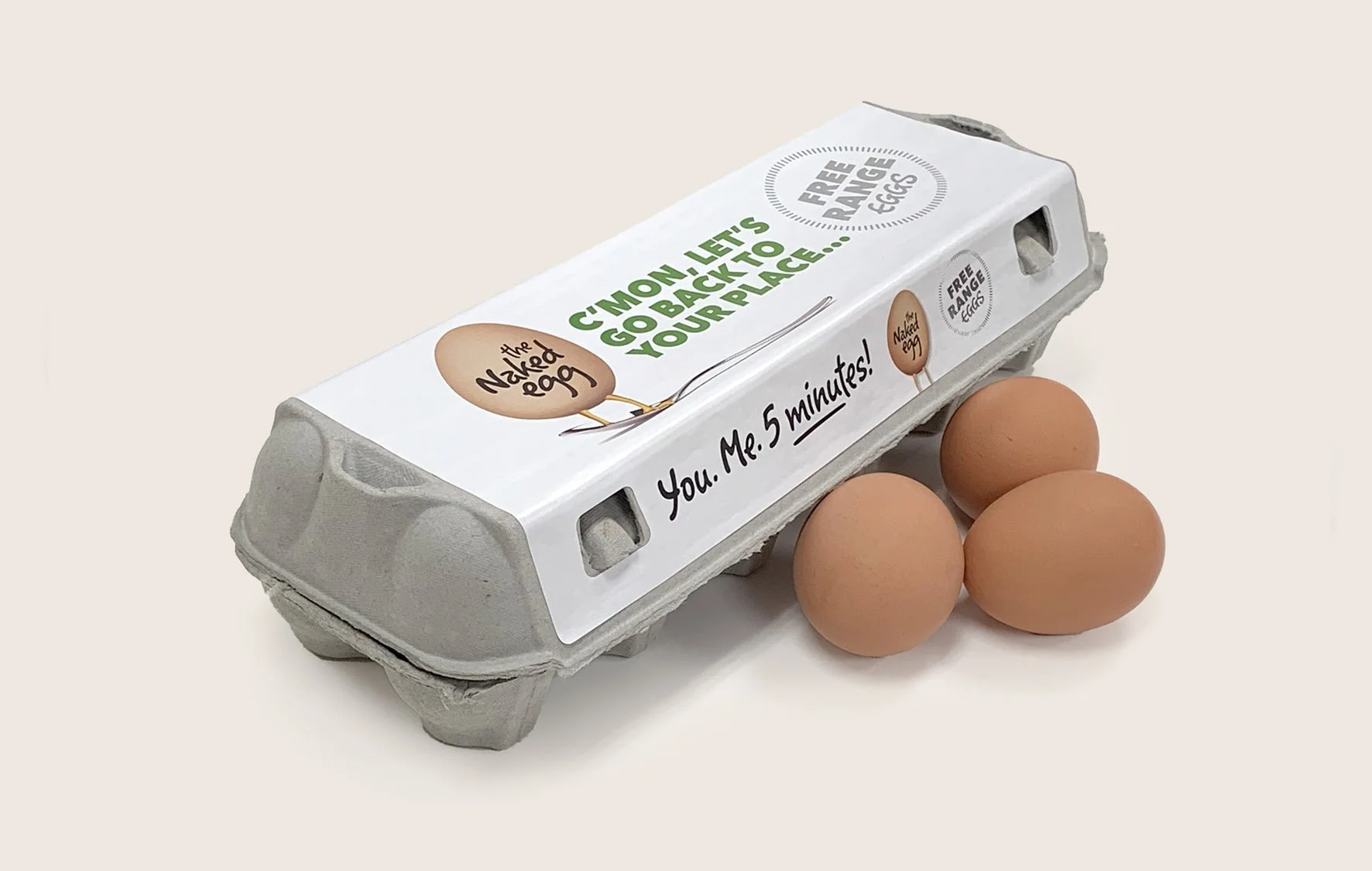
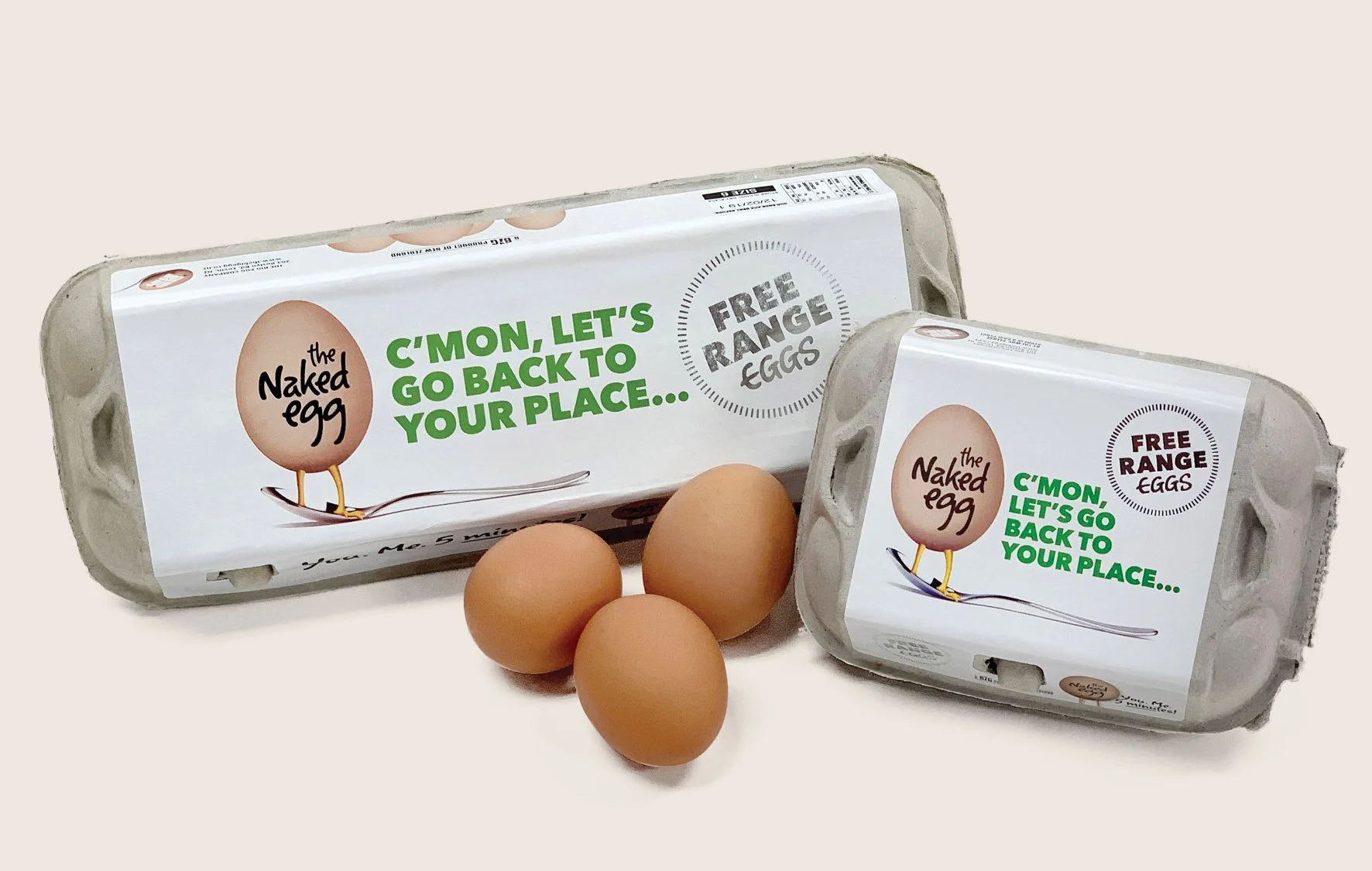
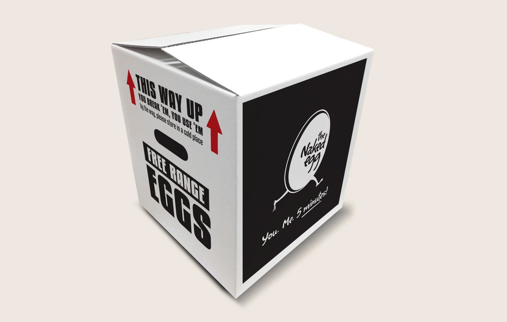
“LET’S GET NAKED”
With an eye on creating a presence in the local greengrocer and café markets, Zealand Farms asked us to create something a little ‘different’ to promote their new free-range eggs and catch the attention of customers.
With a clean design and a theme that’s a little risqué, ‘The Naked Egg’ hit the mark with a quirky, fun vibe and support line.
Product Naming
Visual Identity
Packaging Design
Copywriting